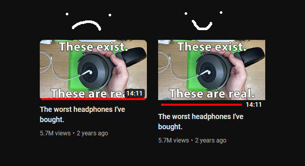
Sometimes, YouTubers don't take into account the overlays YouTube puts on their thumbnails. Because of this, some details may be covered by stuff like the progress bar or the video length.
This puts those details below the thumbnail along with making it square (toggleable).
Here's everything that I know for sure works with it:
- Video length
- Total watched
- Shorts
- Mixes
- Light and dark mode
- Now playing indicator (sadly covers the bottom part of the thumbnail)
- Watch later and add to queue buttons
- Hover preview
- Playlists
Playlists
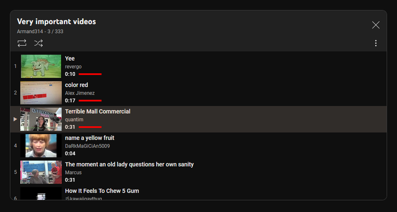
By default, it'll put the overlay under the details as it can't fit under the thumbnail.
However, this means that the title only has a single line to deal with:
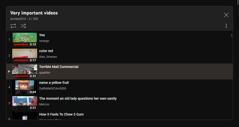
Because of this, there's an option to make it put it over the thumbnail.


