AKA how to use <meta name="viewport">.
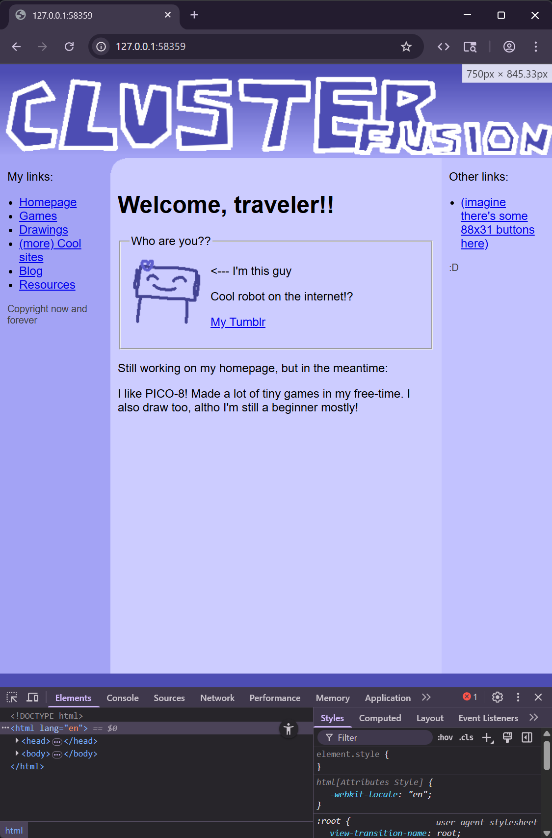
So you're making a website. Let's use this as an example:

Looks great on desktop! On a phone, however:

Ouch. Luckily, there's a really easy way to just get it looking just as it does on desktop. People on mobile will still have to zoom and pan around, but at least they can use your website.
Introducing the <meta name="viewport"> tag!
This special tag, put inside of your <head>, essentially tells mobile browsers how it should display your website. You may already have it on your page. This is a very common one:
<head>
  ...
  <meta name="viewport" content="width=device-width, initial-scale=1.0" />
  ...
</head>
However, you likely shouldn't have it like the above! This is pretty much telling browsers that your website should look fine on mobile, so if your website doesn't, it'll just let it break and bleed like it did to the example above.
A potentially very easy solution would be to just remove it all together. By doing so, mobile browsers will default to just shrinking down your page to try to make it look right. Here's that above website on mobile, but without the <meta viewport> tag:

But this isn't really ideal either. It would be best to say specifically what your website works with instead of just leaving it up to the browser.
So let's actually utilize <meta name="viewport">!
Telling it how to shrink your page
You do this using width. Like for instance:
<head>
  ...
  <meta name="viewport" content="width=800" />
  ...
</head>
...
Here, mobile browsers will display your page as if it's in a 800 pixel wide window, and then shrink it down to make it fit.
Figuring out what size to use for your website
In most browsers, Inspect Element (really called the Developer Tools) will tell you how big the page in pixels is when you resize the page.
So, right click on your webpage, and click Inspect. You can just leave it open; we won't be touching it.
Resize your browser right before the point your website starts to break down. While you're doing this, your browser should show the size of the page at the top right:
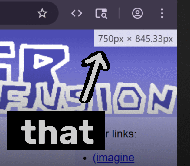
The first number is what you should plug into width. So, for this page, it would be 750:
<head>
  ...
  <meta name="viewport" content="width=750" />
  ...
</head>
...
(If you get a decimal, just round to the nearest whole number.)
That's pretty much all there is to it! Mobile users can now at least now just use your website.