At school, someone was playing around with inspect element. They have gone further than any non-developer soul could do: changed the background of a webpage to blue. I wanted in.
So, I started to fiddle around with it. I started creating calculators in JavaScript that did the impossible (showing work) to quickly complete my math homework. I found a way to unblock YouTube. It was nice.
Later on, I was messing around with those
chrome:// URLs, and on one of the pages I found out that my school attempted to block inspect element. However, it had an error that I don't remember, so it ended up not blocking it.Then COVID-19 hit.
If they did block inspect element, or if COVID-19 hit a bit earlier, I probably wouldn't be making this website right now. Maybe I would've been a failed YouTuber.
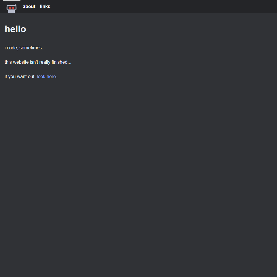
Anyway, I had this in my Obsidian vault. I guess it would be a nice first actual blog post. I've always liked seeing stuff be developed, so maybe you will too?
Version 1
The very start. No source control. 2019 to late 2021.
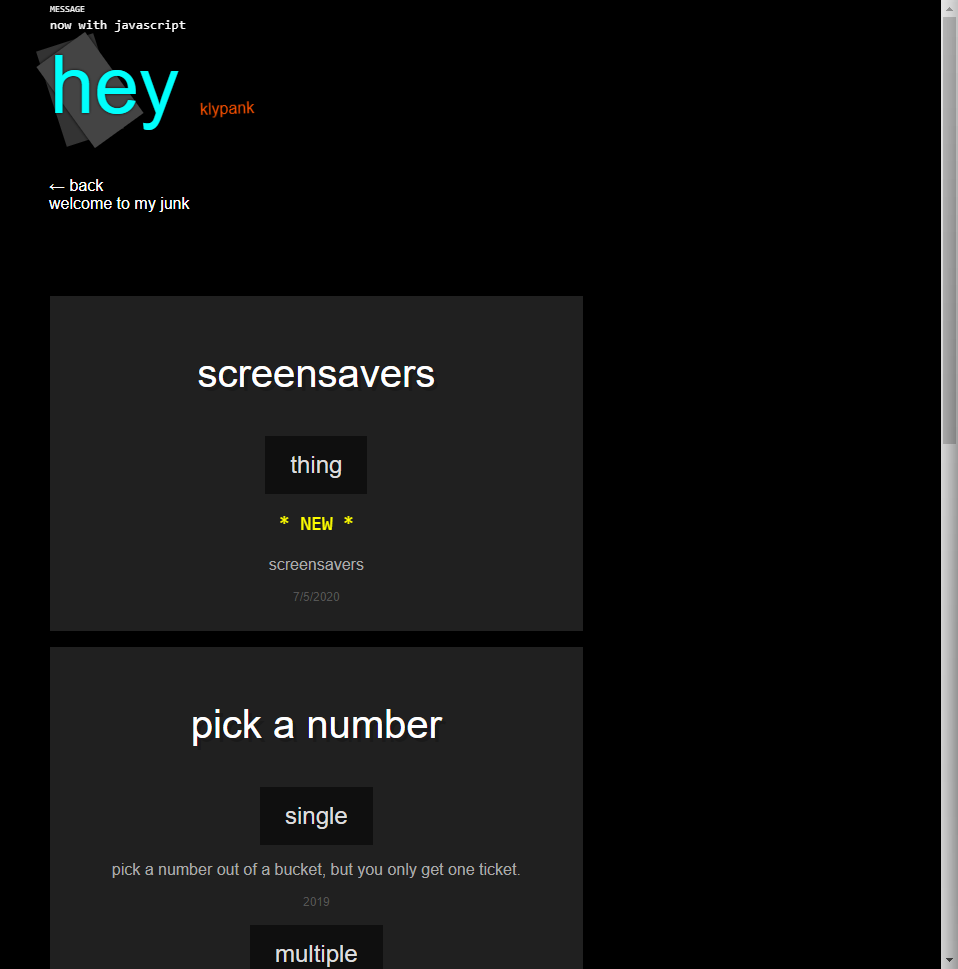
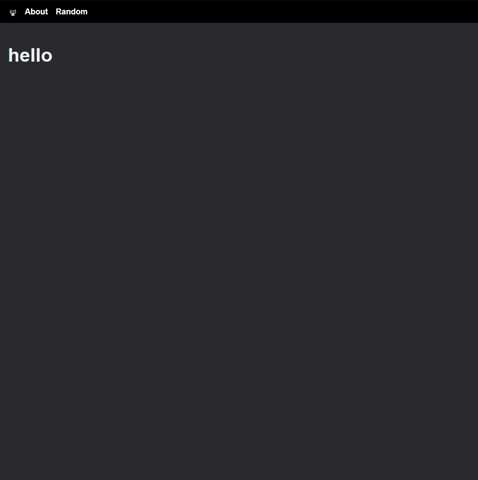
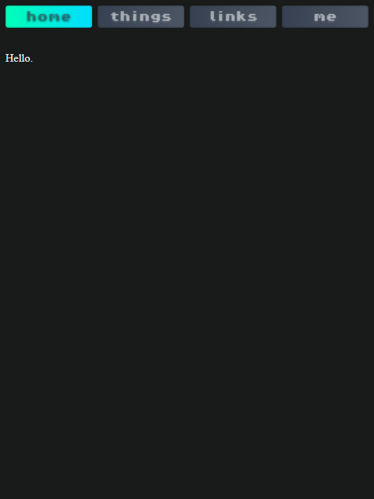
Hey
Back then, my username was "klypank". Horrible name. The only only two things left of it online are a dead Hotline Webring link that I have no idea how to remove, and a StackExchange answer where I was wrong:

Anyways, my homepage looked like this. The rectangles and "Hey" text rotated and changed colors overtime and as you scrolled, neat.
Windows
Later on, I made myself my own windowing system. I then made it my homepage:

I'm still quite proud of this. I definitely felt that at the time, but looking back at it, I kinda did a lot when I was just getting started with programming. I was still doing crap like
y * 1 > 0.Here's some of the features it had:
- Draggable windows, of course.
- Opening and closing animations.
- Loading apps from an HTML file (for example, the main window in the screenshot is loaded from
mainwindow.html).- Preloads them too.
I'm currently remaking this system (still in vanilla JavaScript) and planning on having it be available for download. Would be a fun little project to step away from frameworks once-in-a-while.
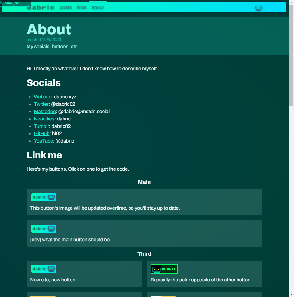
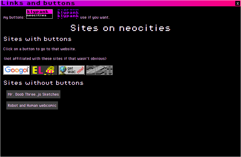
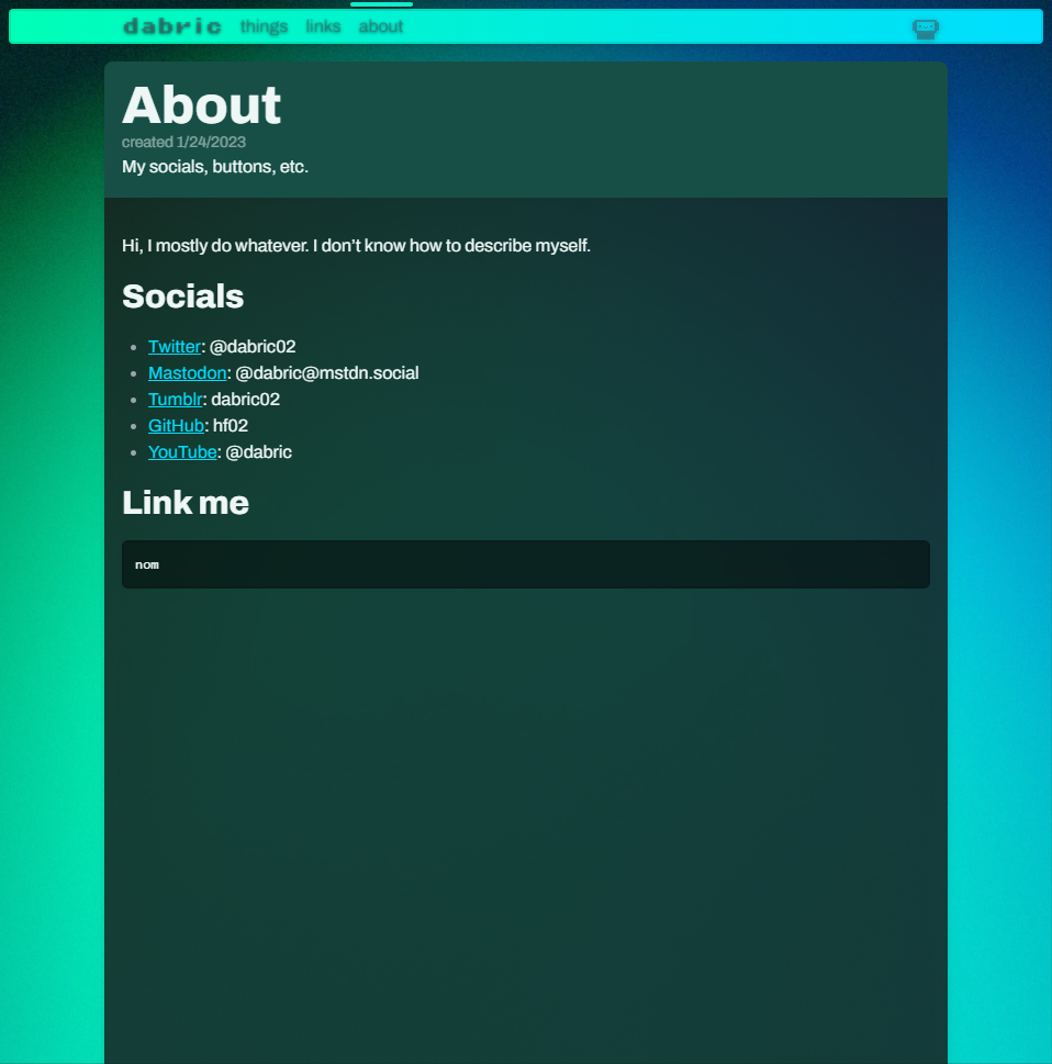
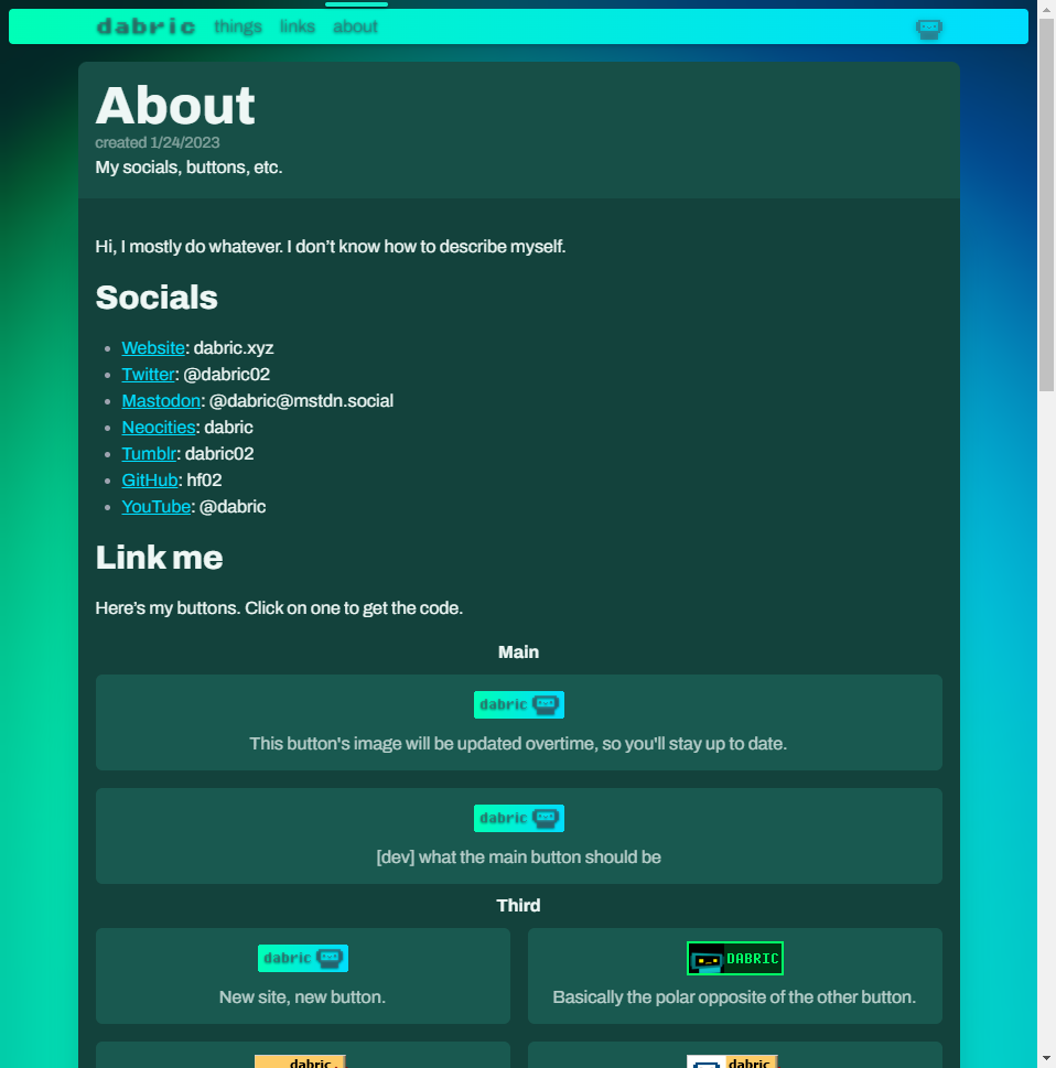
Here's my links and button "page":
Version 2
Wanting to expand in the world of ✨frameworks✨, I went and tried to learn some React. I heard some people talking crap about React, so I tried Svelte, and really easily learned it due to its interactive tutorial, which they've recently improved a hella lot.
Screw a window manager, we're using components now!!!!!!! But uh, how do you make a website with this? Luckily Svelte has something called SvelteKit. It wasn't finished at that time and wouldn't be for another 1.5 years, but I went and used it anyways! My website only broke once.
2021-09-26
The initial commit.

2021-09-29

In the tabs there, you'll see "redsearch". It was supposed to sit between you and your search engine to basically give a more customizable DuckDuckGo bangs (hence redsearch, redirect search), but I never got to finishing it.
Also, the Multibots. At this point in time, I haven't really standardized how they looked yet. Here's a comparison:
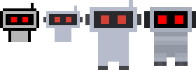
I also already had three buttons with these robots. Never got rid of them; they're still on my about page under "Old and Ugly".
2021-10-16

2022-01-18


2022-01-22
2022-04-10
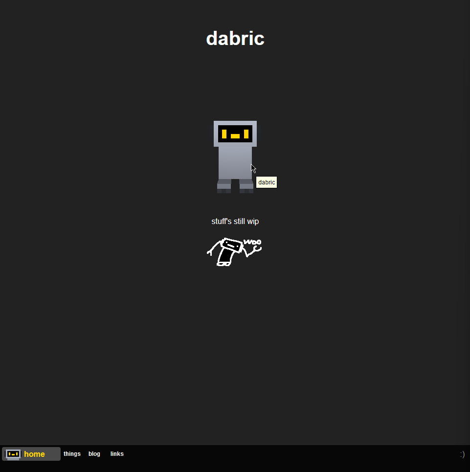
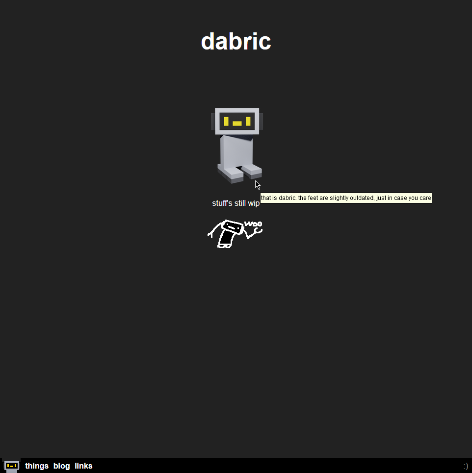
Now whenever you clicked on Dabric, they would just spin around and give some remarks through the tooltip. Nothing much, but hey it's 3D.
The model was very rigid at this time. It was made in Blockbench, and the only moveable limbs were the feet and the head. You may think that that's pretty much how it still is right now, and you would be sorta right; the feet and the head in the current model are connected to some bendy bits. But this older model isn't like that. The feet and the head would just clip into the torso.
2022-04-14
2022-08-??
This is pretty much right before the major redesign.
You can actually see how my website looked like during this period. Go here, and with the power of client-side routing, you can still click on pages while staying be in that old version. Just don't refresh.
2022-08-26

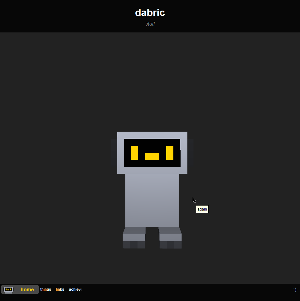
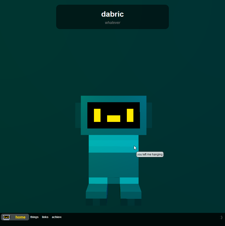
Instead of spinning around for no reason when you consistently click, they'll now fly into the air. Also, no tooltip.
Another feature that was added to the model was the face. It obviously looks different now, but it's also dynamically rendered instead of just being a never changing texture. Now they look even more alive!!!!
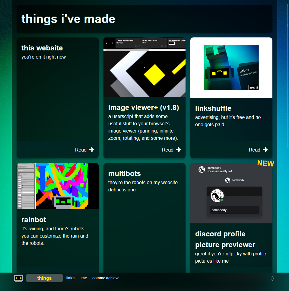
Here's the things page, which are now my posts. Glassy.
Version 3
Version 2's internals was getting a little unbearable for me, so I decided to rewrite everything. Also, almost everything having a blurred background kinda hit low end devices. At least, it seemed to.
2023-01-18
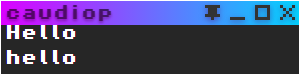
A long time ago I made this app called caudiop, which was an mp3 player in Electron. It was pretty basic, but it had a some features (mostly focused towards being a great miniplayer) that I liked so I stuck with it until I started to use Spotify. Here's a screenshot:

I made this when I was just getting into programming, so of course the code sucked. I heard about React, so I wanted to give it a try by remaking it. I did not get far:
As you can maybe see, the navigation bar for my website is based on the title bar from here. I literally just copy and pasted the code (later adapting it for Tailwind and optimizing it a little).
2023-01-19

2023-01-25
2023-02-23
I for once got an actual domain, dabric.xyz. As of right now, it just redirects to my Neocities website as I don't have Supporter.
2023-03-17
2023-03-18

2023-03-26